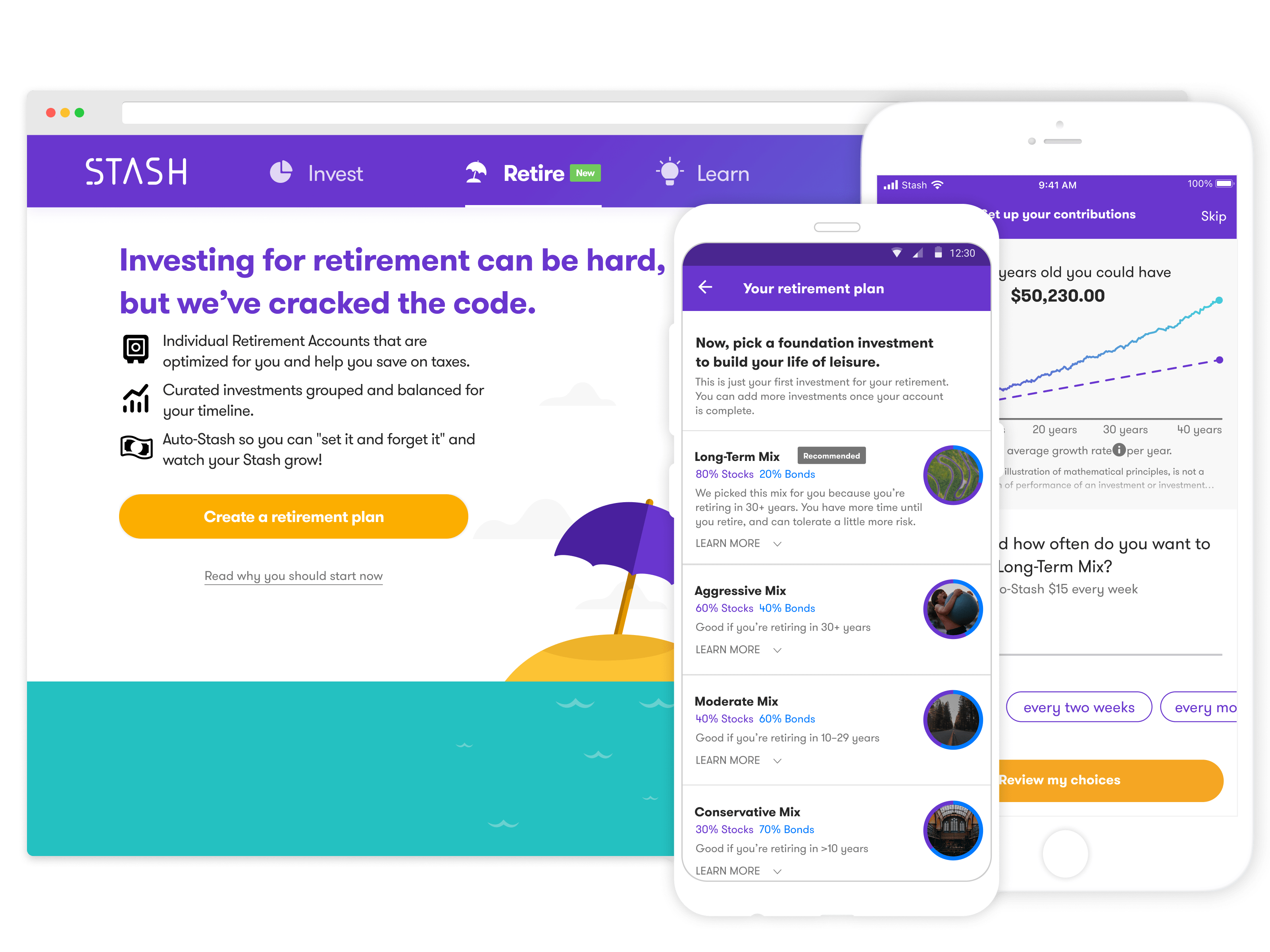
The retirement "add-on" registration had low conversion. And we assumed that users didn't understand the difference between the IRA/ROTH accounts and their brokerage account.
The goals were to: improve conversion of existing users to retirement accounts. Ensure they were educated on the differences and understood the pros and cons of both account types.
My PM and I looked at the funnel data across iOS, Android, and web. The three key problems we identified:
- • The homescreen "marketing card" introducing it had low engagement.
- • After interacting with that card, they would abandon at the initial full screen value proposition.
- • The swipeable value proposition pages weren't being used.
A researcher and I ran usability studies to understand how the current version was received. We learned:
- • Users were concerned an extra account would cost more.
- • They didn't understand ROTH and IRA accounts in comparison to their brokerage accounts.
- • Why would they need both account types?
- • How much should they save for retirement?
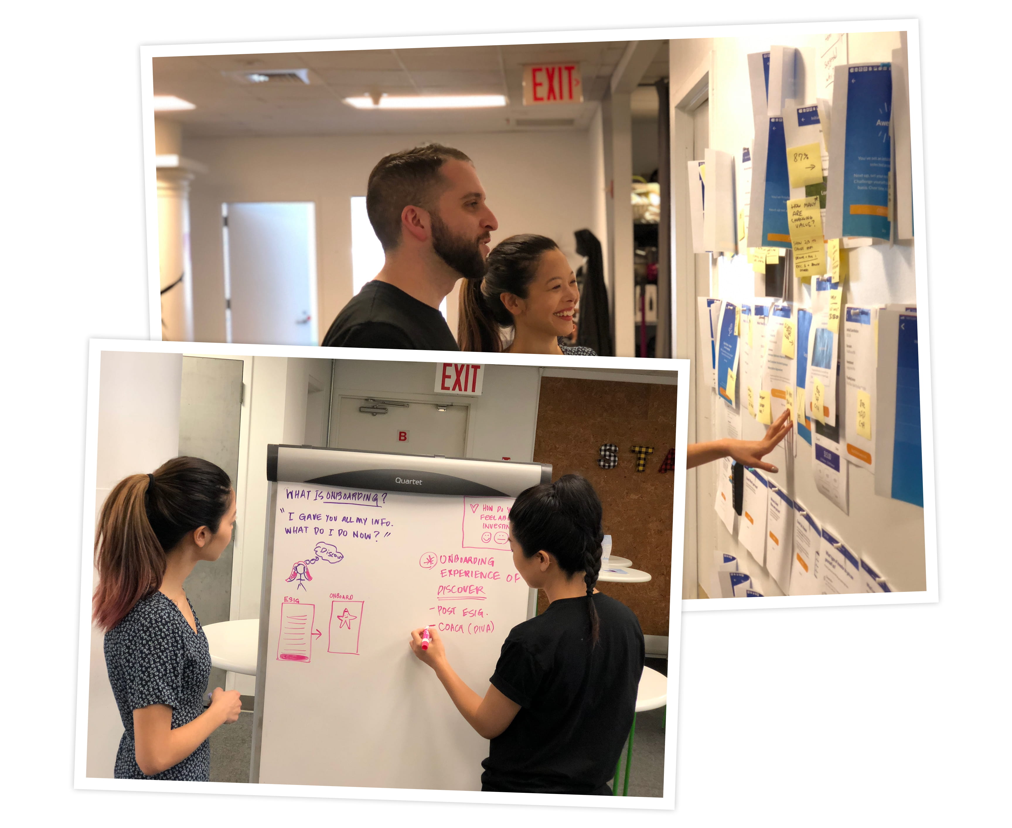
I set up a brainstorming workshop with my scrum team. The focus:
How might we convert existing users to our retirement offering through goal-setting and a clear value proposition?
From this, it was decided that we'd work on improving the homescreen card, try new approaches to the registration, and in the process educate the customer on what ROTHs and IRAs are.
Quick wins
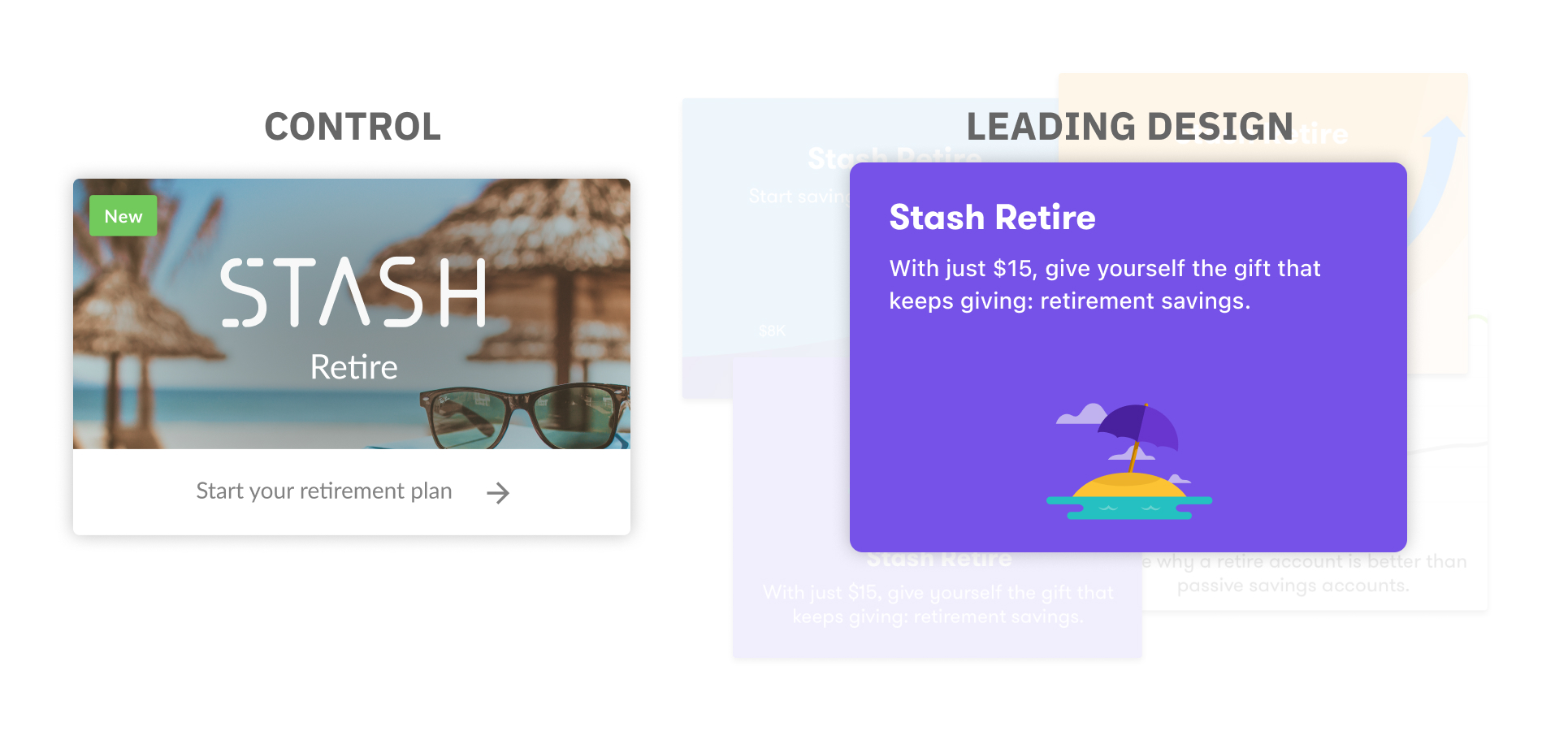
To learn and iterate (and work within our card design system on home) we tested new designs for the cards. After testing ~10 variations against the control, we had a leading design + copy combination that converted the highest.
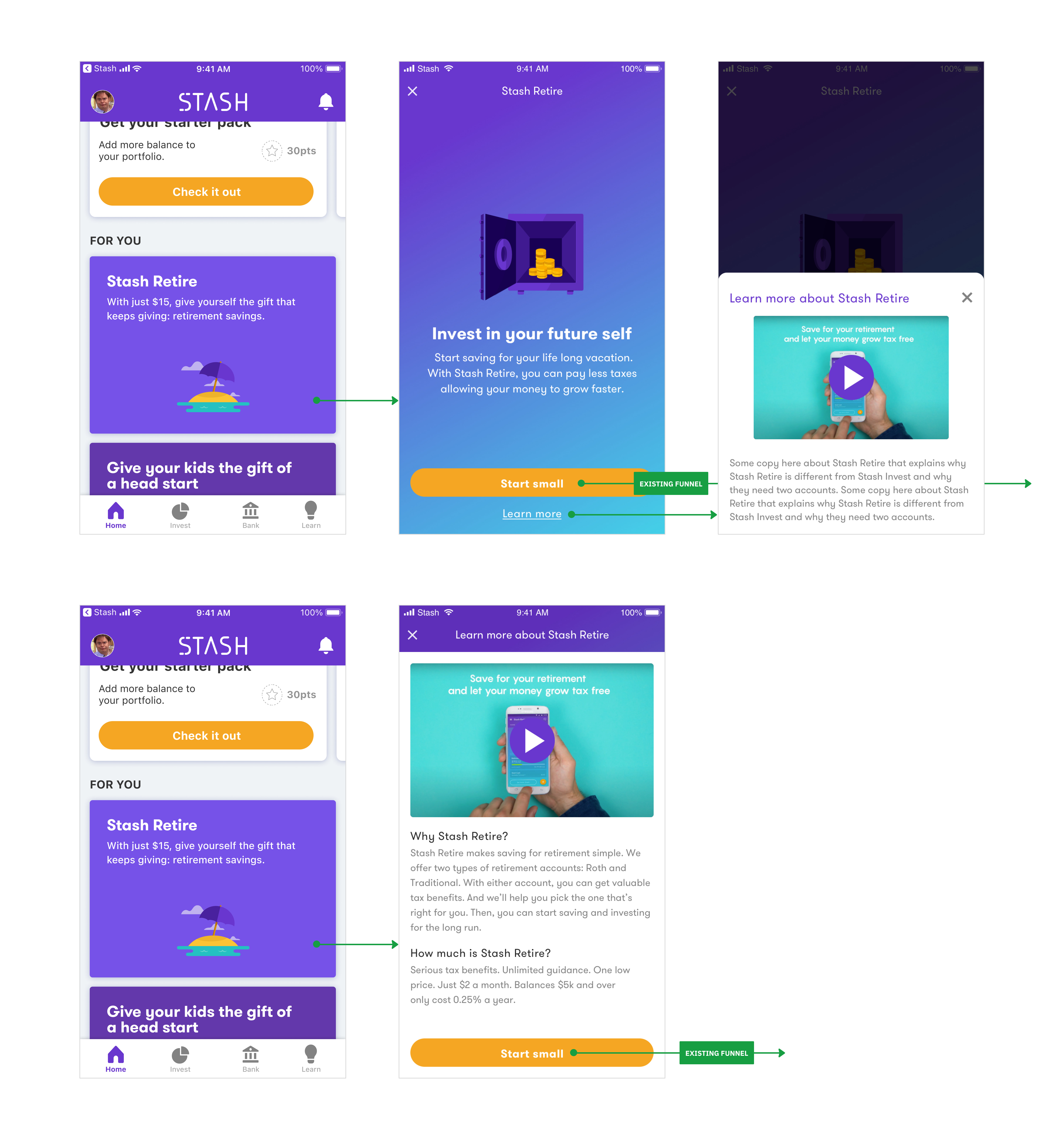
Working with our iOS engineer, my PM and I designed some tests for what would happen after the user taps the card. The iPhone app had a lot of traffic, so we launched these tests there.
With a few, we tried adding new value propositions and content about the retirement product, including a video. With another, I wanted the user to think about their retirement years; where would they want to be and what would they be doing?
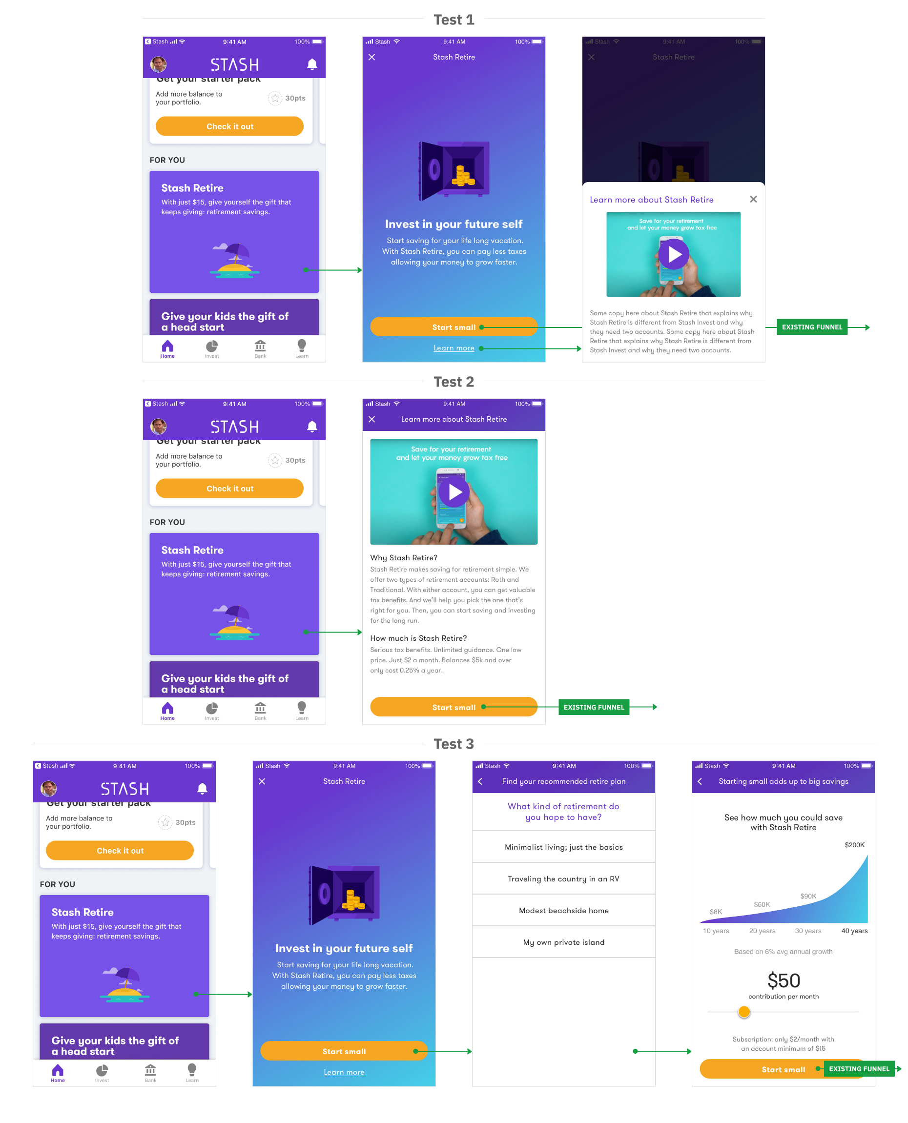
What we learned
- • Graphs and projections were received well and converted well.
- • Conversion was higher = they understood ROTH and Traditional IRAs in comparison to their brokerage accounts.
- • Users needed help choosing investments. The data showed they used the default ETFs but didn't invest beyond those.
- • Almost no one interacted with the videos we embedded.
The results
(Compared to the control – the previous version.)
- • ~3% lift on Auto-Stash enablement
- • ~4% lift on linking funding
- • ~3% lift on signature completion
The final result on iPhone.
The learnings from the iPhone build were rolled out to both Android and Web. Here's the web version.