While I was at TripAdvisor, one of the largest pain points for customers was searching for and discovering content.
They often found it hard to find what they needed. The application's information architecture was fraught with navigational blackholes that were hard to recover from. And TripAdvisor's hotel, attractions, and restaurant bookings were of the utmost importance to the business's bottom line.
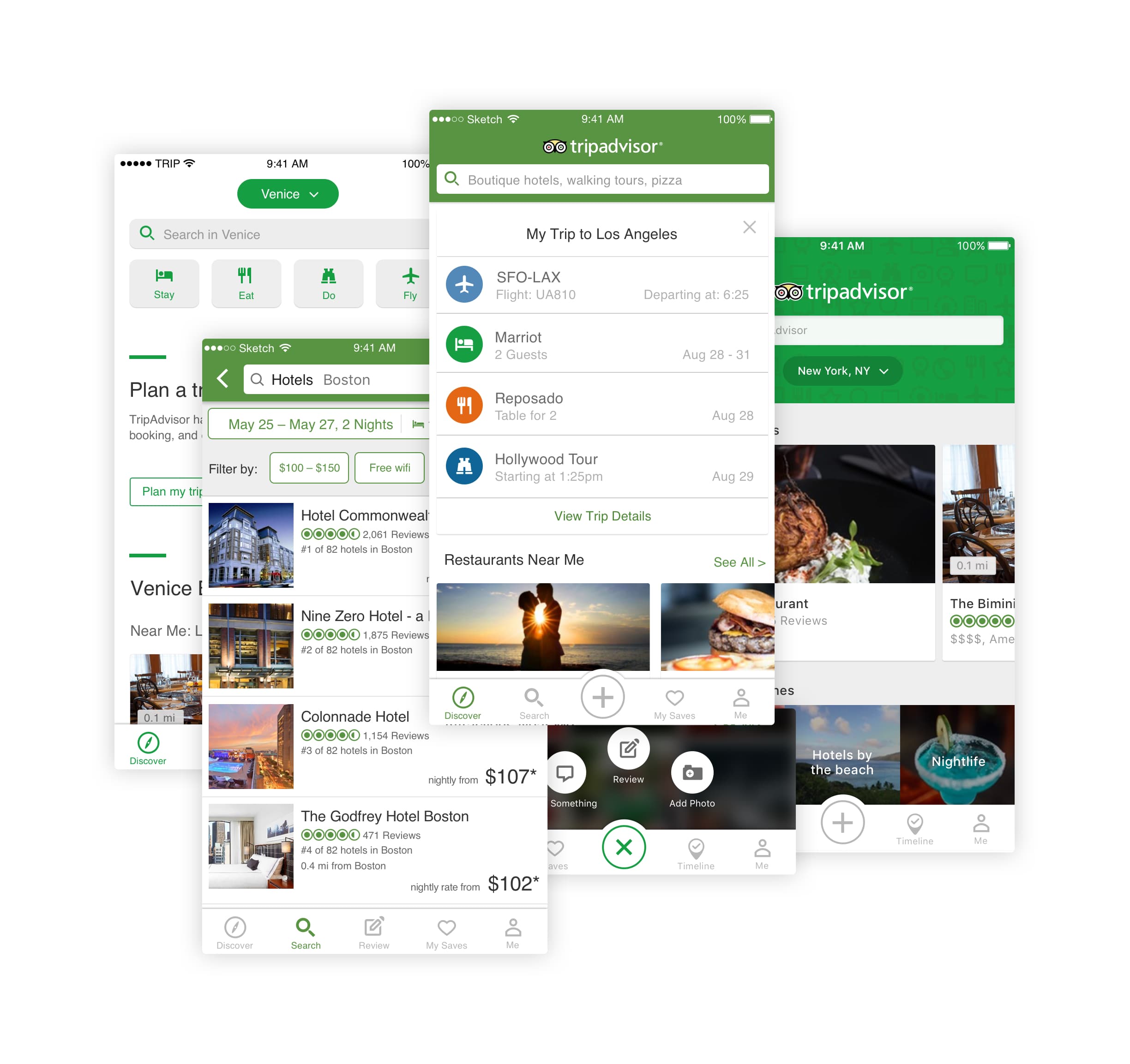
We needed to provide a better platform for customers to find what they need and what they didn't know they needed through machine learning and data science. This was a nearly year-long reimagining of home, search, and discovery.

My team, the mobile product group, gathered business and product requirements from the core verticals (hotels, restaurants, flights, vacation rentals, attractions, and search).
I collaborated with another designer and three product managers throughout the year. We conducted user interviews and usability tests with customers, built prototypes, and iterated on designs every week. To help drive the initial direction, we piggy-backed off a series of tests we had done with personalization of results.
We coordinated with product and engineering to lay out a roadmap, build it in phases, and roll out to limited segments of our audience to monitor performance. Through this phased approach, we were able to learn through following the data and listening to our customers.


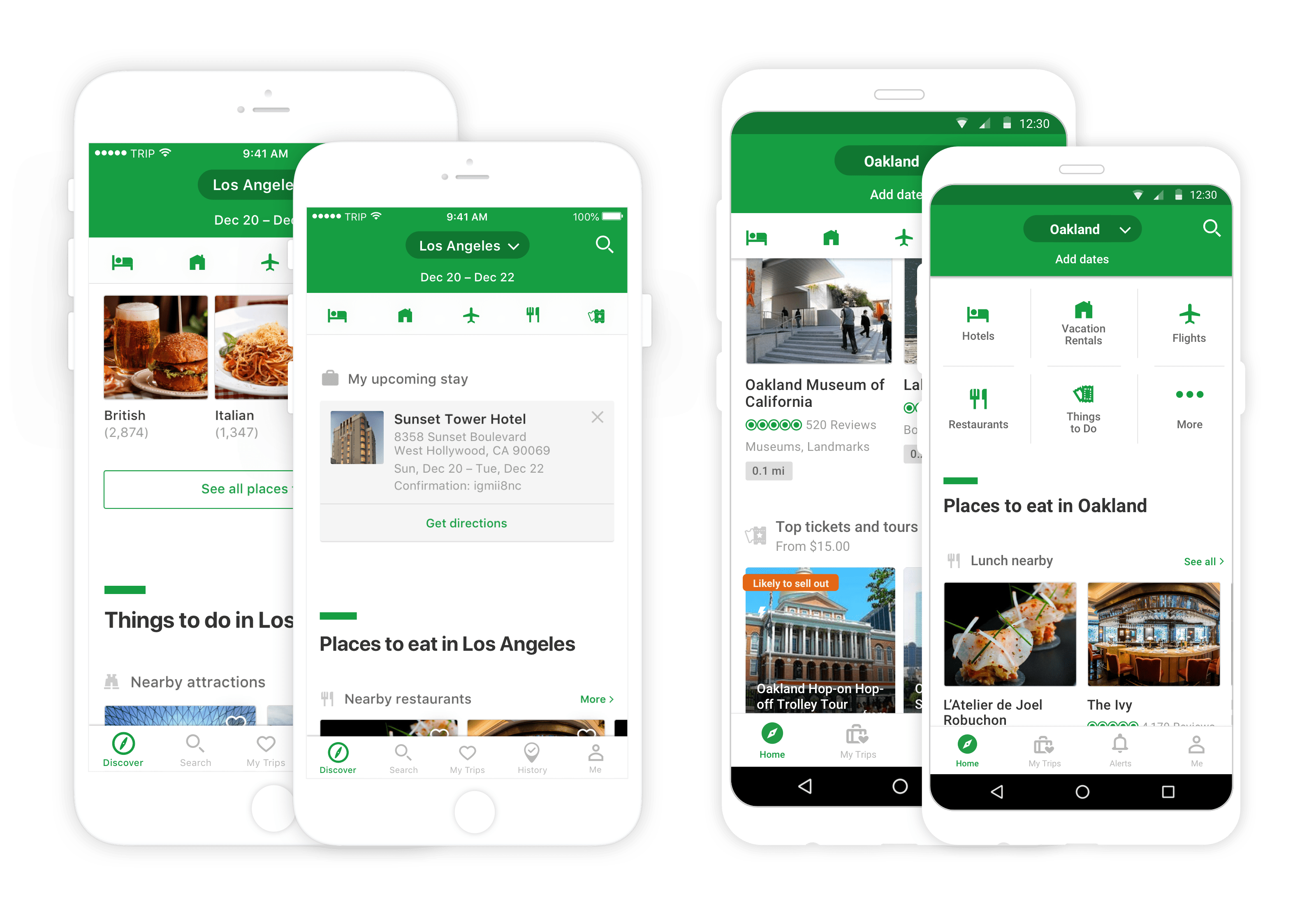
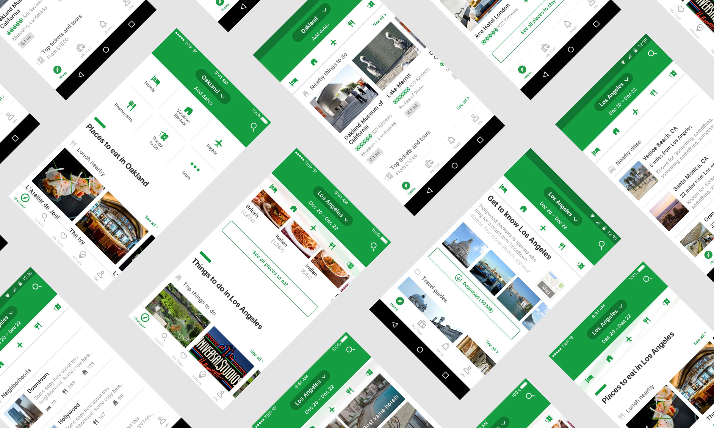
After a year, we built a fully immersive home experience that grounded the customer in their travel destination and provided relevant, contextual content.
The information and results displayed changed with user input (e.g. "I'm traveling to Los Angeles on these dates") or location detection (e.g. we know the customer is at home in Oakland, so show this relevant content). We also used this as opportunity to show sponsored and recommended content through machine learning.
I built a simple prototype in Principle to design some interaction and animation ideas, as well as do some light usability testing during one of the iterations. The final delivered product was altered slightly from this.
Designing and shipping this homescreen was a long and arduous process that yielded great results.
We saw a lift of ~2.5% in hotel bookings, ~4% in restaurant reservations, and ~3.5% in attractions bookings. Weekly active users and average session lengths also increased significantly from the previous generation of the home page.
I learned three things:
- 1. That while personas are a great tool, they're not the end all be all for deciding what customers need. We found conflicting goals and hybrids of our personas.
- 2. That coordinating a project at this scale needs a single decider. We had too many cooks in the kitchen at first.
- 3. The average American traveler takes two big trips a year, and a vast majority need help deciding where to go.