After building out the web application, we ran the numbers on our registration funnel.
There were significant drop-off points in the funnel that we needed to address for our quarterly KPIs. The registration flow hadn't been updated in over a year, and given the recently released authenticated web application, we decided it was time to overhaul.
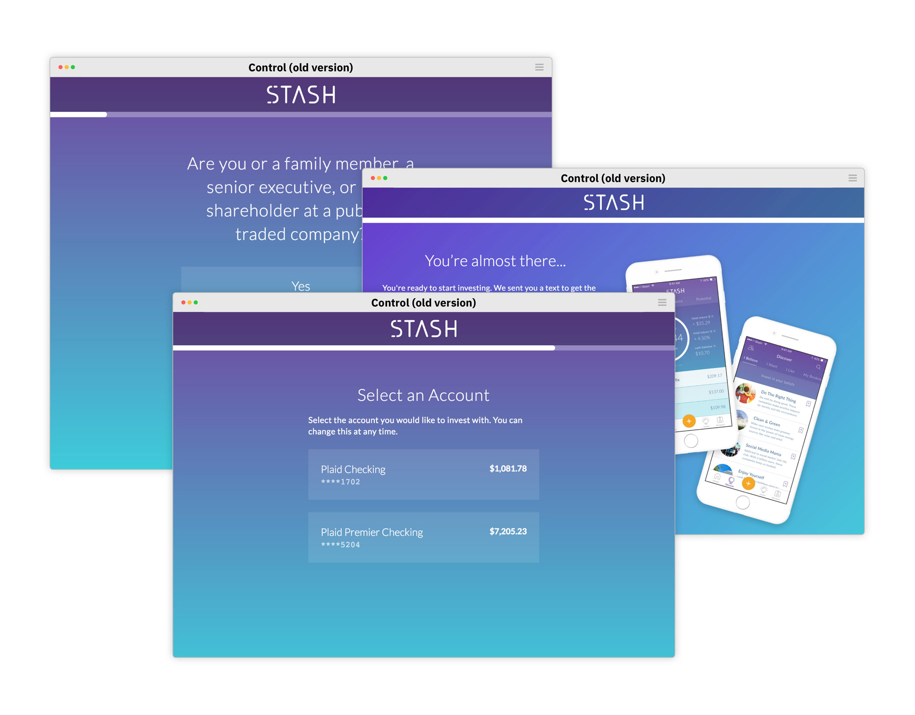
Following the initial quantative analysis, we collaborated with a user researcher to test the existing registration with customers. We identified a number of pain points:
- • User fatigue (the flow was too lengthy and arduous).
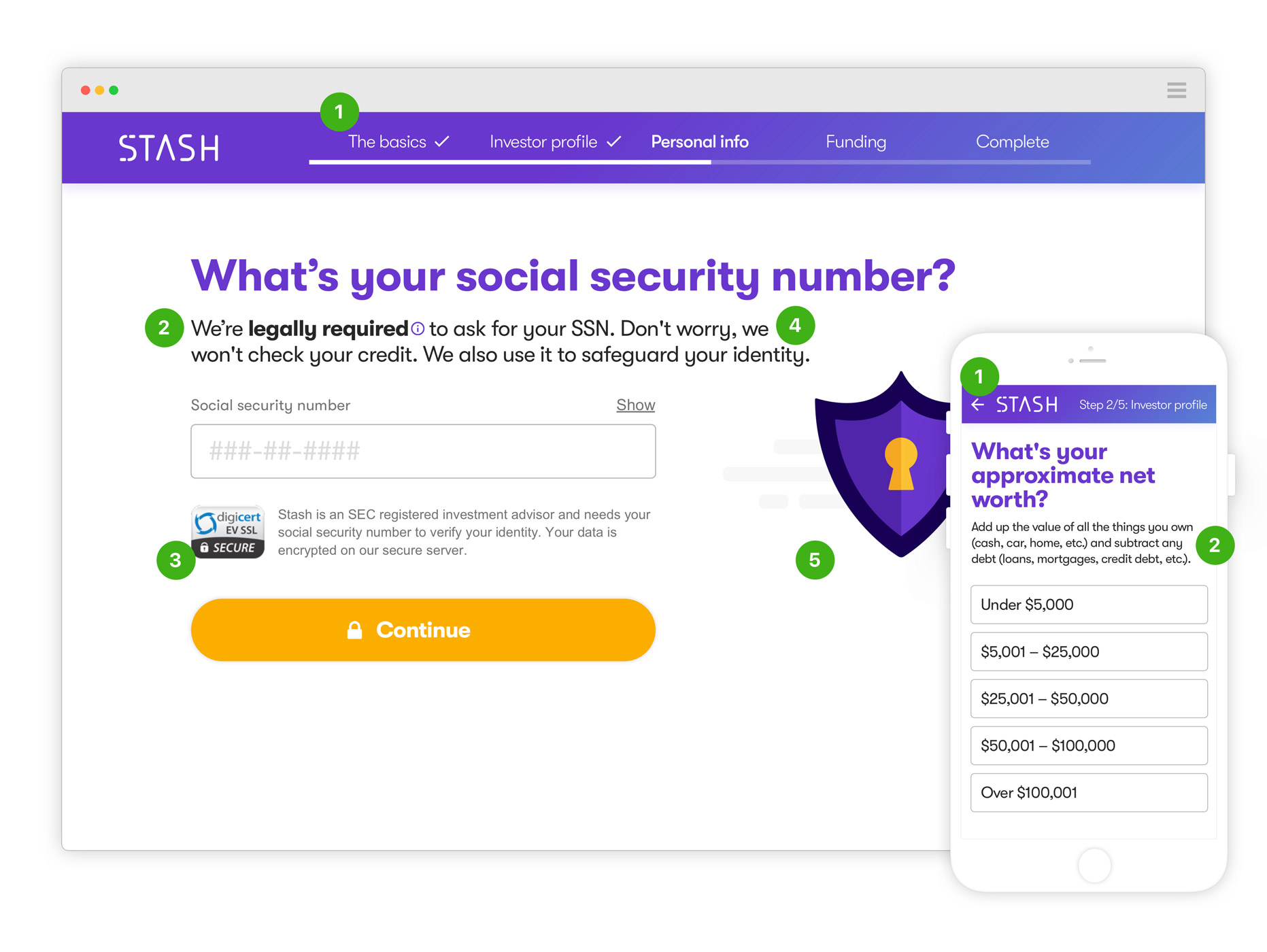
- • Lack of clarity around certain questions.
- • Unfamiliarity with certain investing concepts or terms.
- • General distrust of linking bank and/or providing us with their SSN.
- • Poor form-field validations.
- • Poor legibility of important text on a busy background.
I worked with my product manager to address the problem areas in the registration funnel.
I designed and prototyped a few variations, which we conducted usability testing on aided by our user research team. Throughout the quarter, we continued to design, build, iterate, and test. The following video highlights the userflow that we shipped.
We made the following updates and improvements:
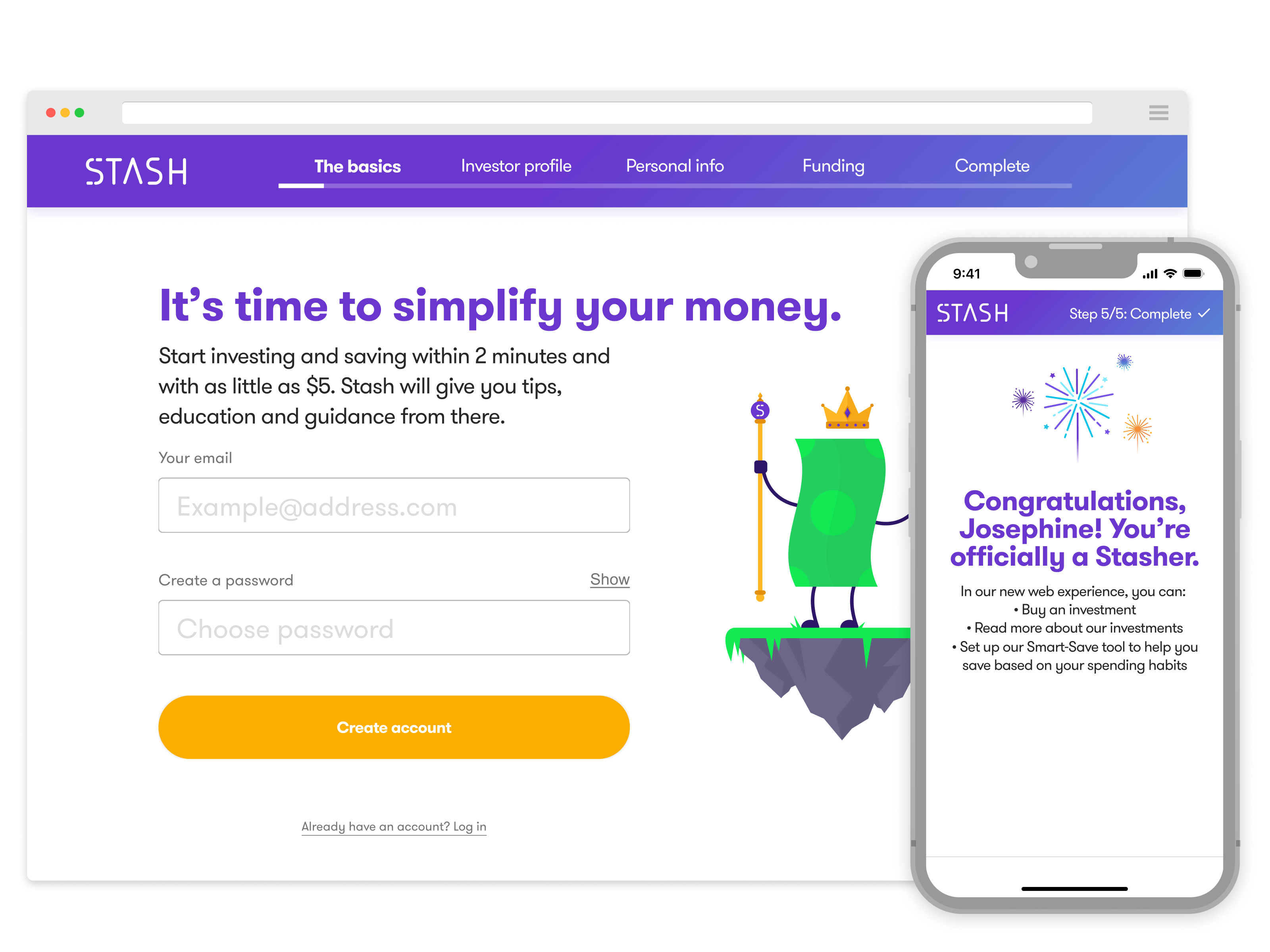
- 1. We broke blocks of questions up into "chapters" to help ease the fatigue.
- 2. Gave more context and clarity to questions customers got tripped up on.
- 3. Simplified the layouts and color palette to reduce strain and cognitive load.
- 4. Worked with our copywriter to give the messaging a friendlier and congratulative tone.
- 5. Designed animations and illustrations to add delight and help explain complex investing concepts.