When I joined Stash in April 2017, there was no dedicated web experience. There was only a lightweight registration, dead-ending with a link to download an application. This was a disappointing experience to many customers.
Some customers also perceived our native applications as more "casual" and "passive", so we needed to gain their trust and confidence with a more robust web presence that empowered them.
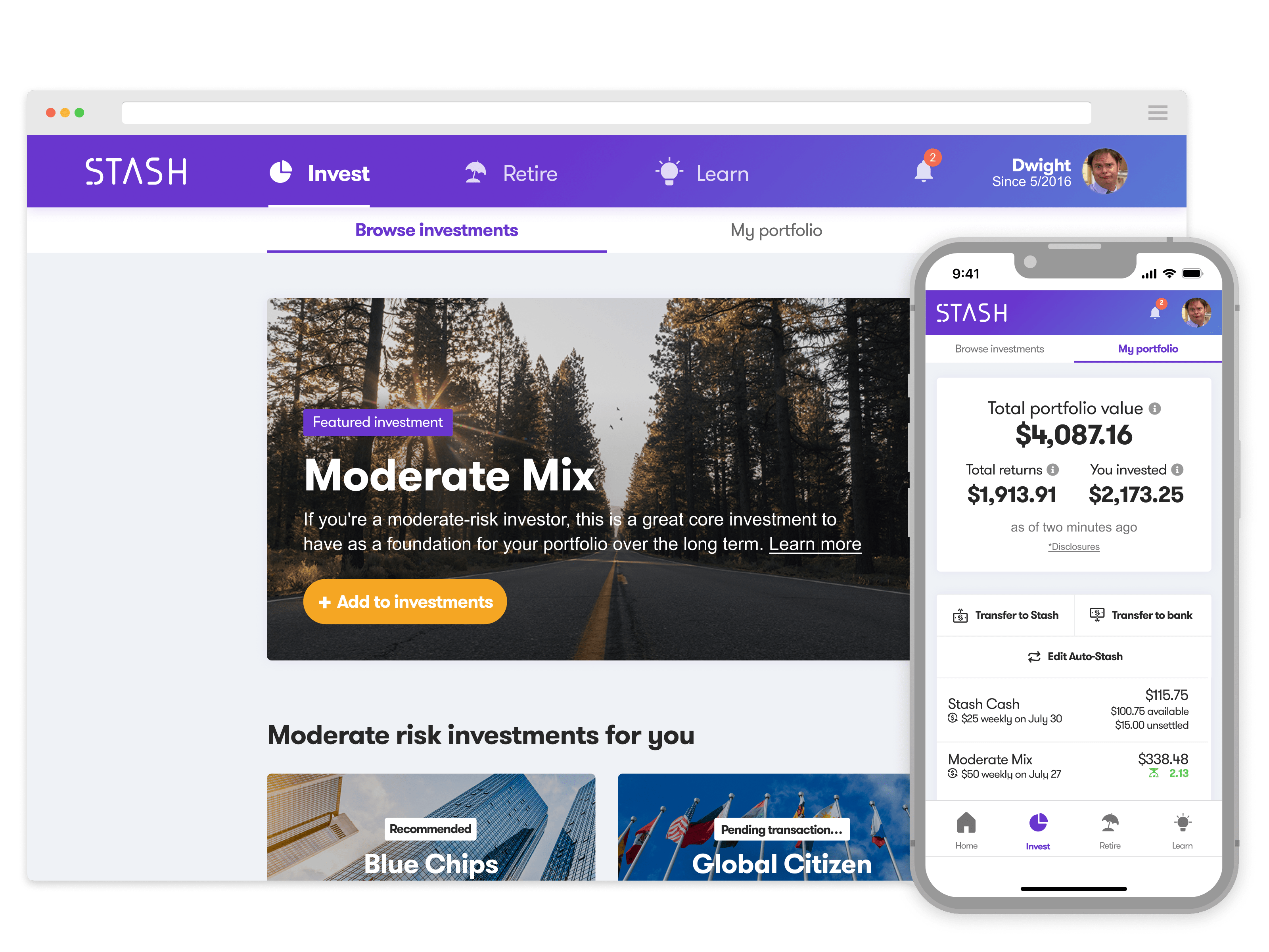
The executive team tasked me with building out a web experience that could rival the legacy iOS and Android applications, serve as a way for us to mature our design language, and give us freedom to explore new concepts for our brokerage and retirement accounts.

We read customer support messages and app store feedback, listened in on support calls, and gathered insights from internal stakeholders.
We conducted interviews with executives, customer service, engineering, and product teams to better understand why we were building it, who it was for, and what types of features they thought our customers needed.
I lead an abbreviated design sprint with my squad. We set a challenge to create a best-in-class web application that builds trust and confidence for our customers. We identified our core customers, mapped out user journeys, and brainstormed ideas on what our customers would want and need.
We then crafted a roadmap full of features that had the highest potential impact with the lowest lift on engineering and design.


During one quarter, we collaborated extensively with stakeholders and engineering to build out a fully independent web application.
We rapidly built, tested, and iterated on buying/selling investments, money movement, Auto-Stash (automatic investing), Smart-Save (automatic savings based on spending), browsing/searching for investments, and general account management features.
Three months with my squad went by fast. I am very proud of the work that we accomplished in the time we had together. Visit the Stash® web experience to explore.
We saw a significant lift (averaging ~2.2 transactions/week) in the number of weekly transactions when compared to the native applications.
Overall, the web application customers were shown to have lower churn rates on our core features. The web application customers were also shown to own greater than 10 investments, whereas the native application customer owned eight investments on average. We also increased our weekly active users by over 150% in under a month.
I learned a few things during this project:
- 1. That I should I consider back-end or database technical constraints earlier in design and research.
- 2. To lean more on existing data structure UI and IA patterns, given that ~60% of our traffic was on mobile. Less is more.
- 3. People are both independent and dependent. Many of our inexperienced investors needed a balance of guidance and freedom.